Branding

Atlantic Bateaux Piriac
2024
A rotisserie chicken brand that owns its U-turn
Rooster is a rotisserie chicken restaurant brand. The goal: a strong visual identity that breaks away from the usual chicken codes (warm colours) and fully owns this change of direction.
Spotting the industry's codes, the better to move away from them.
Electric purple instead of the expected reds and yellows.
A name in massive capitals, with a flame-shaped S for the grill.
Logotype, pictogram and tone-on-tone versions for every medium.
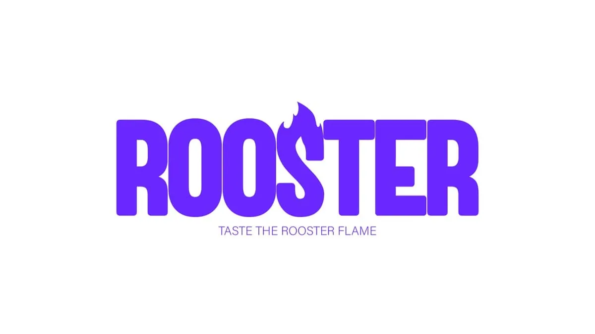
Purple replaces the warm colours: you can't mistake Rooster.

The flame S also works on its own, as a pictogram.
2024

2021 – 2022