Branding

Atlantic Bateaux Piriac
2024
A soft, comforting art direction for a new Parisian cookie brand
Oh Damned is a new cookie brand in Paris. It wanted a simple, clean and comforting art direction that appeals to younger customers as much as to older sweet tooths, with a real feeling of softness and comfort.
Setting the tone: indulgent, soft, and welcoming to all ages.
Rounded shapes and warm browns, like cookie dough.
A simply drawn cookie and a name in generous letters.
Brown, cream, dark: a palette that makes you want to take a bite.
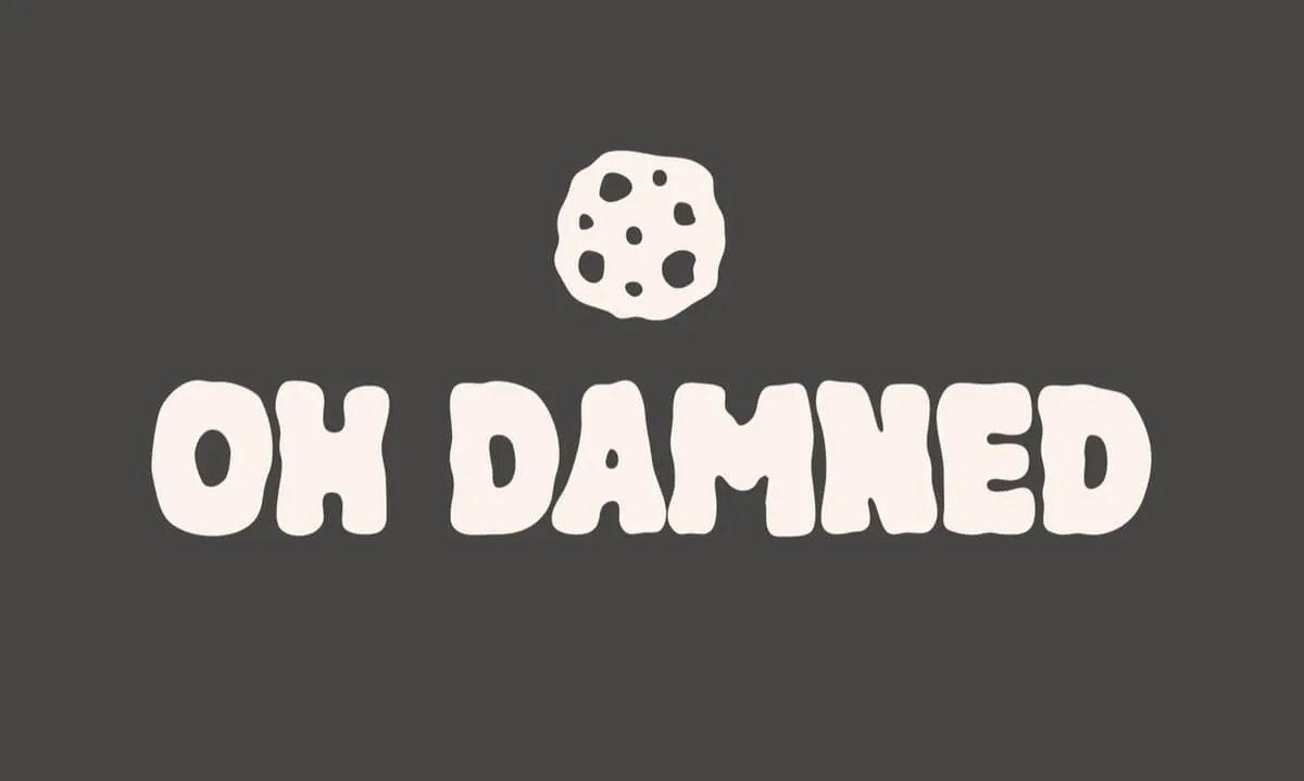
Round letters and a simply drawn cookie.
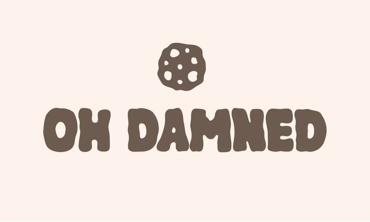
A palette of browns and cream, soft and indulgent.
2024

2021 – 2022