Graphic design
Chikin Bang — posters
2026
New packaging for corndogs and wings, in Korean pop style
Chikin Bang, a Korean street food restaurant, wanted new packaging for its corndogs and wings, keeping the Korean pop style of its restaurants' identity.
Renewing the packaging without betraying the restaurants' identity.
The brand's Korean pop style, applied to packaging.
A shared pattern for corndogs and wings, easy to recognise.
Four colours (yellow, red, blue, purple) for the whole range.
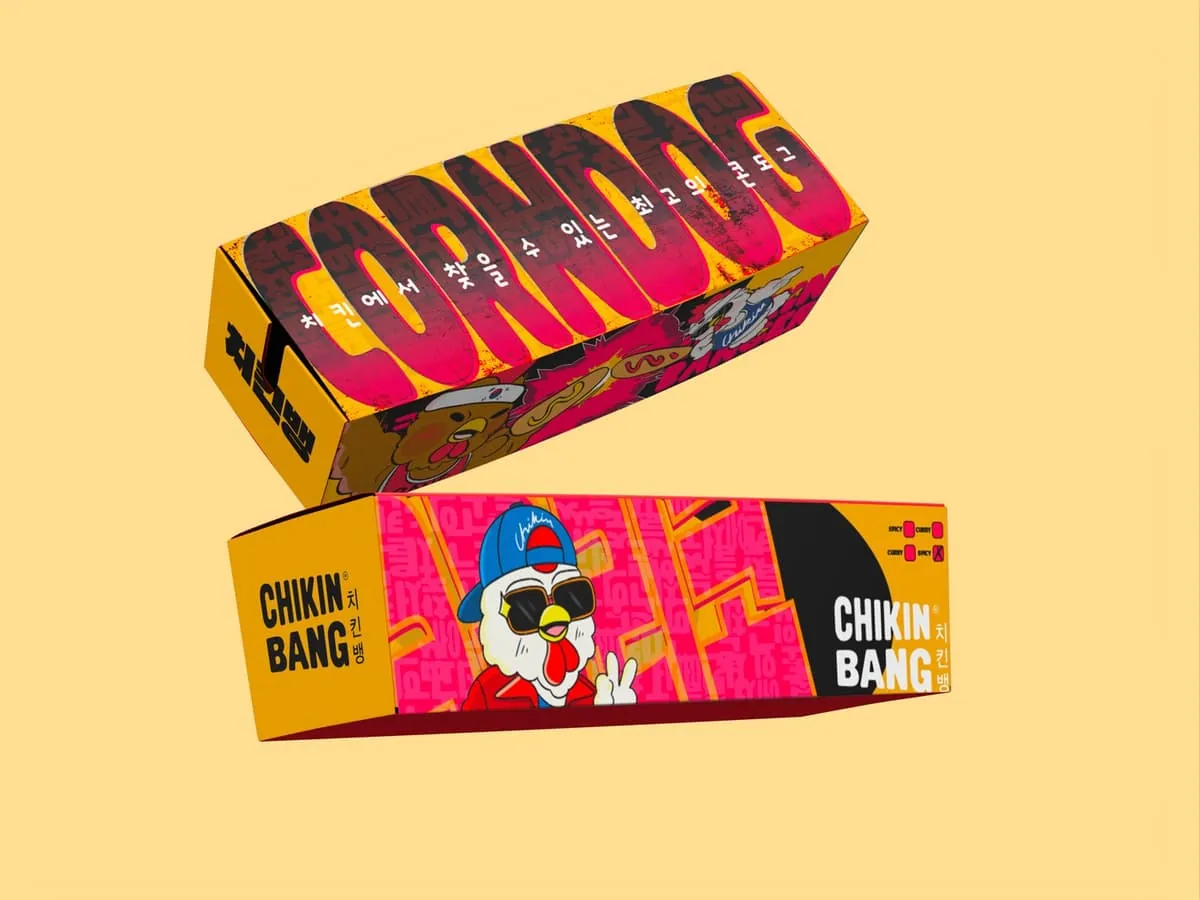
The corndog, in yellow.
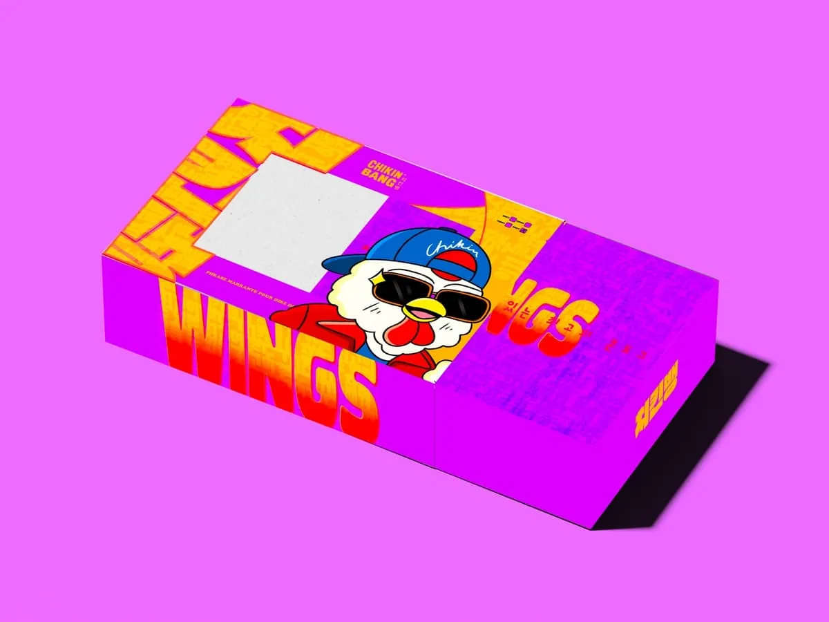
The wings, with the same pattern in purple.
2026
2026